
Decor & Renovation
Tiffany Pratt’s best advice on how to brighten up your home with colour

Photography by Tara McMullen
Decor & Renovation
Tiffany Pratt’s best advice on how to brighten up your home with colour
When designer and author Tiffany Pratt walks into a room, she lights it up—and that’s exactly how she designs a space, bringing it to life through the use of exciting, bold hues. We sat down with the HGTV star to talk about her favourite colour combos and easy ways to brighten your home.
Known for her love of colour, DIY and all things vintage, Tiffany Pratt has been designing bright spaces since 2006. The host of HGTV’s Home to Win recently wrote her DIY-filled book, This Can Be Beautiful. Read on for her best colour tips.
How would you describe your home?
It’s a party for the senses! My home meets so many needs: It’s a meeting place, a resting place, a hosting space and a safe place to dream. I love every nook and cranny. I like to leave larger surfaces in my home white as a backdrop, but everything else is up for grabs. I want a cohesive look throughout, so it feels like one big room with the colour pink as the lead character.
Your home has many vintage elements. What’s your best tip for shopping for vintage and antique items?
Be open to the unexpected. My most successful scores are ones I don’t plan or expect. I’ve acquired my most favourite things on the side of the road or at auctions.
What are your favourite colour combinations?
Anything with pink—I especially love bright neon pink with softer light grey. Pairing a bold colour with a neutral shade is pleasing to the eye because it’s a visual representation of opposites. I’m also drawn to combining complementary colours—hues that sit opposite each other on the colour wheel—like mustard yellow with deep coral, or raspberry with teal.
What colours don’t you like?
Brown is not on my love list. It’s the mud pie of the colour wheel. It’s effectively all colours mixed together, and I’m more drawn to brighter, vibrant shades. I’m also tired of the grey-on-grey theme that design has been going through. I’m not one for safe choices—I like challenges—so these colours feel too basic for me. Choosing the perfect shade or colour combinations can feel challenging, but it’s really worth the effort when it means you will create a space that evokes the style and feeling you want.
When decorating with vibrant colours, how can we keep the look consistent throughout the home?
Homes should tell a colour story by carrying shades of a colour throughout the house. You don’t need to match the exact shade or tone from room to room, though. Try painting one space in your favourite shade, then pepper that colour in the rest of your home by introducing such decorative items as books, small countertop appliances, pillows or towels. All of these things can be easily changed, and they add a cheerful feeling to a space without much cost or effort.
What’s a surprising way to add colour to a room?
I know that this may seem retro and unconventional, but try coloured lightbulbs. Adding temporary colour to a space is unexpected and fun. There are some incredible products available now, like Hue bulbs, which allow you to remotely customize and change the colour from your smartphone or tablet.
What should dictate a room’s palette?
I believe choosing the colours should be itself. The proper shade can transform the vibe of any room—small, large, bright or dark. If a colour elevates the space and your mood, then there are no rules.
What are your favourite sources for colourful decor and furniture?
Outside of custom upholstering and do-it-yourself, I love Baba Souk, Furbish Studio, Jumbled, Jonathan Adler, Bonnie and Neil, and Judit Just.
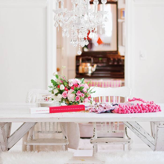
Pretty In Pink
Pratt’s dining room has a colourful layered look that’s great for entertaining, hosting meetings and getting crafty.
 Photography by Tara McMullen
Artfully Curated
When the homeowners approached Pratt to design their new condo, they had one request: a simplified and bright abode. The colours in their art collection inspired the look of the living room. Yellow, blues and light purple are repeated throughout the space in furniture and accessories.
 Photography by Vanessa Galle
Colour Therapy
This space—one of three bright treatment rooms in a multidisiplinary health clinic in Toronto—may be tiny, but according to Pratt, that’s no reason colour can’t make a big statement.
 Photography by Vanessa Galle
Pratt's Top Paint Picks

Paint, farrow-ball.com.
1. Cinder Rose NO. 246
It’s a feminine colour, but the muted tone makes it a great choice for more open spaces.
2. Vardo NO. 288
Try this bold shade on the front door or a focal wall.
3. Yellow Cake NO. 279
If you love neon shades, then this one’s for you. Use it as an accent on furniture.
Bright Buys
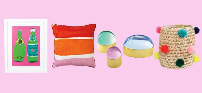
Perrier framed art, $160, furbishstudio.com. Hand-painted cushion, $169, bonnieandneil.com.au. Globo boxes, $265 to $532, jonathanadler.com. Pom-pom basket, $58, babasouk.ca.

Comments