
Home & Garden
Spring decorating trend: Contrasting tones

Home & Garden
Spring decorating trend: Contrasting tones
[caption id="attachment_3473" align="aligncenter" width="620"]
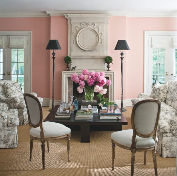 Walls: Fruit Shake 2088-60;
Trim: White Dove OC-70, Benjamin Moore.
Photography courtesy of Benjamin Moore.[/caption] Pastels are to spring decorating what bold, saturated hues are to summer. But what if those two seasonally-driven approaches to colour collided? It's actually something that we're seeing a lot of lately, as rooms painted in pale, powdery shades are dressed with a few richly-hued statement pieces. It's a daring break with that old decorating rule that advocated matching tones between colours in the same space, and I must confess that I'm falling for it— hard. Take this pretty living room above, for instance. With walls painted in a super-feminine, soft coral ( Benjamin Moore's Fruit Shake 2088-60), the last thing you'd expect would be a bold hit of black. Yet there it is, in the form of twin floor lamps flanking the fireplace. It's that contrast in tone between the lamps and the wall colour that takes the "sweetness" out of the space, and brings a refreshing edge to the room's very traditional decorating style. For more inspiring ideas on how to decorate with black, click here! Follow me on Twitter!
Walls: Fruit Shake 2088-60;
Trim: White Dove OC-70, Benjamin Moore.
Photography courtesy of Benjamin Moore.[/caption] Pastels are to spring decorating what bold, saturated hues are to summer. But what if those two seasonally-driven approaches to colour collided? It's actually something that we're seeing a lot of lately, as rooms painted in pale, powdery shades are dressed with a few richly-hued statement pieces. It's a daring break with that old decorating rule that advocated matching tones between colours in the same space, and I must confess that I'm falling for it— hard. Take this pretty living room above, for instance. With walls painted in a super-feminine, soft coral ( Benjamin Moore's Fruit Shake 2088-60), the last thing you'd expect would be a bold hit of black. Yet there it is, in the form of twin floor lamps flanking the fireplace. It's that contrast in tone between the lamps and the wall colour that takes the "sweetness" out of the space, and brings a refreshing edge to the room's very traditional decorating style. For more inspiring ideas on how to decorate with black, click here! Follow me on Twitter!
Comments